A New Look!
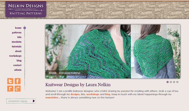
Things look a little different around here, don't they? Another project that was LONG in the making, my website/logo redesign, is DONE!
This time I hired a designer and came up with a graphic concept and layout and then had MANY late night meetings with my webslave (aka cherished husband) as we solidified exactly what I wanted and how to make that work.
I am totally smitten with it right now, even though I've been looking at it for weeks on end... I especially enjoy the bead that moves up and down the yarn strand as you go through the menu!
I could get all geeky on you and tell you that it's database driven, and easily updateable, with templates that pull code from Ravelry to seamlessly integrate their cart into my site, but I wouldn't really understand what i was talking about. Let's just go with that it's back-end is awesomesauce and my hubby is the BEST!
I can't wait to hear what you think... and I hope you have a lovely weekend!

Bonjour,
ReplyDeleteFor the banner, beige knitting on beige background : not very discernable (that is my opinion).
Why did'nt you choose your own green Kinetic on beige background ? Or change the color of the background.
You know people don't like change ; I found the knitting (colour and design) of the previous logo so beautiful.
Salutations.
Elisabeth.
I do like your redesign, but have to agree that the beige on beige does not sufficiently highlight the loveliness of the knit shown. More contrast?
ReplyDeleteThanks for chiming in! For the website I really wanted the banner to take a background to whatever knits I am focused on at that time. These are the ones highlighted in the image rotator. It's important for the design to be timeless and not upstage those images.
ReplyDeleteThat said, I realized the blog header really needed to have more "punch" and I've switched it up a bit! More color!!!!
Thanks again for your input! I really appreciated it!
Hi Laura - love the new design, I knew something was happening as I noticed that the group avatar on Ravelry had changed when I looked in on the plod along! I am getting there with it and enjoying the fun group. Happy knitting
ReplyDeleteLove the new you! It's professional and inviting at the same time :) Looking forward to you next Craftsy class; I enjoy the 1st one and learned a lot!
ReplyDeleteThanks Michelle and Caroline! I was going for professional and inviting... so glad I achieved it : )!
ReplyDeleteLove the new site design, I agree with Michelle that it looks professional and inviting. I love the subtle use of the knitting as texture in the header and footer on your main site while keeping the content area simple. The blog does look better with a bit of color since there is no shadow separating it from the content area.
ReplyDelete